Made the logos point to their respective sites.
Source Link

As for a standard way, I am not aware of there being any that is agreed upon by everyone, but from my experience, vegetarian V is usually written as a plain V in green (or with green background) and vegan V is usually written with a leaf sprouting from one or both of the arms of said letter.

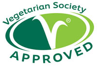
Vegetarian society logo:

enter image description hereVegetarian society logo

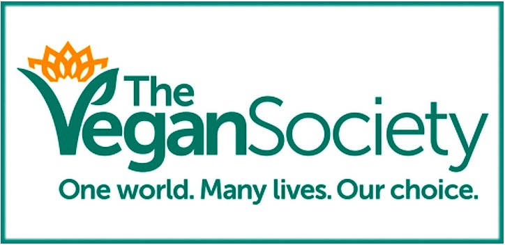
Vegan society logo:

enter image description hereenter image description here

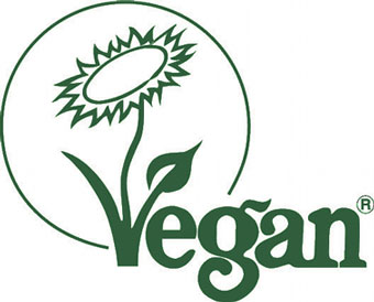
And vegan labels as well:

enter image description hereenter image description here

Then again, the difference and implication is rather subtle and there is a lot of false positives amongst all of the existing logos so this is far from universal.

Based on this, the V and V+ icons may be a better suit. The one problem I see with those is the eye of the beholder: Is V vegan and V+ vegetarian because Vegetarians eat what vegans + some other things or is V vegetarian and V+ vegan because vegans are further away on the V spectrum?

If possible, a legend could be used to teach your audience the exact meaning. If that is not possible, maybe surrounding one V with clearly vegan food (like carrots and stuff) and the other V with clearly non-vegan stuff as well (like carrots AND milk carton) may be what you are looking for.

Good luck with your website and if you manage to solve this problem, I would be interested in hearing how.
As for a standard way, I am not aware of there being any that is agreed upon by everyone, but from my experience, vegetarian V is usually written as a plain V in green (or with green background) and vegan V is usually written with a leaf sprouting from one or both of the arms of said letter.

Vegetarian society logo:

enter image description here

Vegan society logo:

enter image description here

And vegan labels as well:

enter image description here

Then again, the difference and implication is rather subtle and there is a lot of false positives amongst all of the existing logos so this is far from universal.

Based on this, the V and V+ icons may be a better suit. The one problem I see with those is the eye of the beholder: Is V vegan and V+ vegetarian because Vegetarians eat what vegans + some other things or is V vegetarian and V+ vegan because vegans are further away on the V spectrum?

If possible, a legend could be used to teach your audience the exact meaning. If that is not possible, maybe surrounding one V with clearly vegan food (like carrots and stuff) and the other V with clearly non-vegan stuff as well (like carrots AND milk carton) may be what you are looking for.

Good luck with your website and if you manage to solve this problem, I would be interested in hearing how.
As for a standard way, I am not aware of there being any that is agreed upon by everyone, but from my experience, vegetarian V is usually written as a plain V in green (or with green background) and vegan V is usually written with a leaf sprouting from one or both of the arms of said letter.

Vegetarian society logo:

Vegetarian society logo

Vegan society logo:

enter image description here

And vegan labels as well:

enter image description here

Then again, the difference and implication is rather subtle and there is a lot of false positives amongst all of the existing logos so this is far from universal.

Based on this, the V and V+ icons may be a better suit. The one problem I see with those is the eye of the beholder: Is V vegan and V+ vegetarian because Vegetarians eat what vegans + some other things or is V vegetarian and V+ vegan because vegans are further away on the V spectrum?

If possible, a legend could be used to teach your audience the exact meaning. If that is not possible, maybe surrounding one V with clearly vegan food (like carrots and stuff) and the other V with clearly non-vegan stuff as well (like carrots AND milk carton) may be what you are looking for.

Good luck with your website and if you manage to solve this problem, I would be interested in hearing how.

Source Link

As for a standard way, I am not aware of there being any that is agreed upon by everyone, but from my experience, vegetarian V is usually written as a plain V in green (or with green background) and vegan V is usually written with a leaf sprouting from one or both of the arms of said letter.

Vegetarian society logo:

enter image description here

Vegan society logo:

enter image description here

And vegan labels as well:

enter image description here

Then again, the difference and implication is rather subtle and there is a lot of false positives amongst all of the existing logos so this is far from universal.

Based on this, the V and V+ icons may be a better suit. The one problem I see with those is the eye of the beholder: Is V vegan and V+ vegetarian because Vegetarians eat what vegans + some other things or is V vegetarian and V+ vegan because vegans are further away on the V spectrum?

If possible, a legend could be used to teach your audience the exact meaning. If that is not possible, maybe surrounding one V with clearly vegan food (like carrots and stuff) and the other V with clearly non-vegan stuff as well (like carrots AND milk carton) may be what you are looking for.

Good luck with your website and if you manage to solve this problem, I would be interested in hearing how.